Garish but great: Flying skate Canucks jerseys enjoy a renaissance
Credit to Author: Gordon McIntyre| Date: Fri, 06 Dec 2019 01:52:22 +0000
The Saturday matinee at Rogers Arena will feature two clubs who joined the NHL at the same time, the Canucks and the Buffalo Sabres, and for the occasion the Canucks are going retro.
Not retro all the way back to 1970, when Vancouver and Buffalo began play, but rather to the ’80s: They’ll be wearing the infamous yellow Flying V jerseys during warmup and then don the black unis with the Spaghetti Skate for the 1 p.m. game, one of four times they’ll be worn this season.
“By popular demand, the black skate jerseys are back,” said Chris Brumwell, the Canucks vice-president of communications, fan and community engagement.
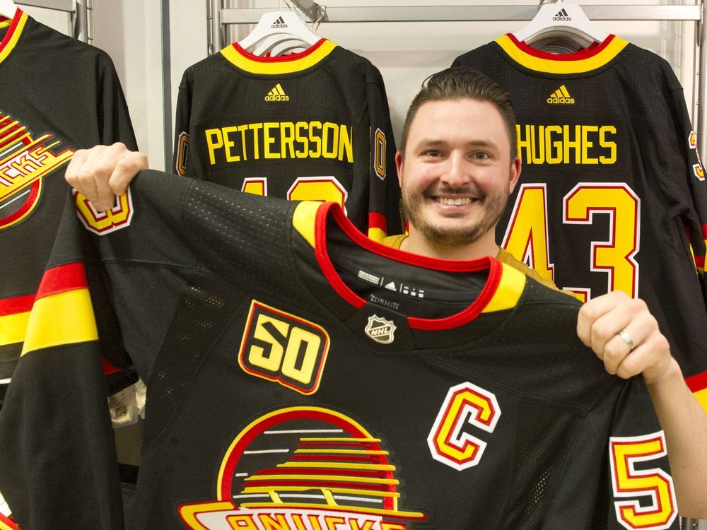
For their 50th season, the Canucks updated the blue orca design, also known as the Free Willy. And for a third jersey the team will wear a modernized version of the original 1970 uniform designed by East Van kid and freelance graphic artist Joe Borovich, now 80 and living in West Vancouver.
“They’ve twisted the hockey stick a bit, made it at an angle and changed the colours a bit,” Borovich told Postmedia recently. “Things only I’d notice.”
The Borovich design — crisp, clean, simple, a hockey stick overlaying a rink that forms a C for Canucks — beat out big marketing firms from the East back in the day. The colours — blue, green and white — represent the ocean, forests and snow-capped mountains.
Defenceman Harold Snepsts models his second Vancouver Canucks jersey, the Flying V, circa 1979 — he first joined the blue-and-green Canucks in the 1974-75 season.
The Flying V was the brainchild of artists in San Francisco who were paid $100,000 in 1978 dollars to come up with a colour scheme that turned out to be as far from Borovich’s as possible, one they said conveyed aggression and that would create “happy, upbeat” players.
But it was the Spaghetti Skate the club wore during its magical, if ultimately heartbreaking, run to Game 7 of the 1994 Stanley Cup final, a nail-biter final game watched by 4.957 million viewers on CBC.
With new a new American owner, the orca replaced the skate, and in 2007 the blue and green colour scheme returned.
“Each jersey has a nostalgic connection to it based on the age group of fans of that era,” the Canucks’ Brumwell said.
“For me, I connect to the black skate jersey. My son connects with the blue orca jersey.
“Other people like the Flying V for all the fun memories those bring back.”
The club’s 50th anniversary motto is “Colourful Past. Bright Future.”
“That sort of insinuates that there have been a lot of different jerseys, and each one is popular in its own way,” Brumwell said.
CLICK HERE to report a typo.
Is there more to this story? We’d like to hear from you about this or any other stories you think we should know about. Email vantips@postmedia.com.