‘It’s as good as it gets’: Twins unveil redesigned uniforms
The Minnesota Twins unveiled new uniforms on Friday featuring redesigned home, away and alternate looks in addition to a new secondary hat and a revamped font.
“It’s a culmination of an evolution our organization has gone through,” said Twins executive vice president Joe Pohlad. “It’s a visual representation of that. We haven’t made a significant change in our uniforms and marks in quite some time and we haven’t done a complete overhaul in our marks since 1987. It seemed like the right time.”
The Twins aimed to streamline a uniform that featured elements from different eras of the franchise. One of the driving forces behind the redesign came from the generational shift in how fans are consuming baseball.
“A lot of the way fans engage with their teams are on their cell phones, so we sought to create a uniform and marks that are legible on both physical and digital media,” Wolff said.
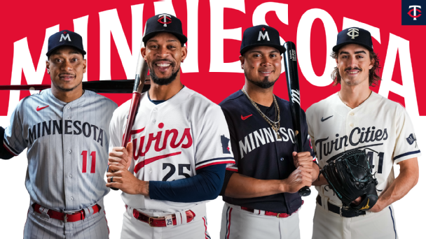
The new home jersey features the Twins script across the chest that no longer has a drop shadow or multiple colors, now written just in red. Additionally, the “win” in Twins is underlined, a tradition introduced when Minnesota won the World Series in 1987. The away uniforms also feature pinstripes, which were previously only on the alternate home uniforms from 2010-2018.
“The goal is to create something timeless and the measure of success is longevity,” said designer Matthew Wolff, who grew up a Twins fan. “The longer the logo lives, the more successful it is. With uniforms, City Connect are timely and right now. But when you talk about a team’s core identity, those are supposed to be built to last.”
The uniforms also feature a new hat with a white “M” and a red mark meant to represent the North Star, an emblem now used across all four Minnesota sports teams. The “M” hat represents the first time since 2013 the team will wear a hat showcasing the letter.
“The ‘M’ hat has such a strong passion around it that when we had discussions, we talked about bringing it back,” Pohlad said. “But we didn’t want to screw up a good thing. We wanted to make the next thing.”
The home sleeve features a navy Minnesota silhouette with a red North Star on the location of Minneapolis and St. Paul.
Additionally, the Twins are introducing a new alternate uniform with a cream base and “Twin Cities” written across the chest. The cream contrasts with a dark navy blue and an all-navy hat to complete the look.
For Wolff — a lifelong Twins fan — the project represented a dream come true.
“It’s as good as it gets. Hopefully Twins territory likes it, but ask me again in a couple of years,” Wolff said. “If the Twins win a World Series in a uniform that I designed, I’ll die a happy man.”